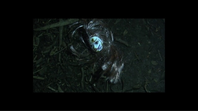
Looking back at my previous blogs, I have noticed that a number of them needs to be improved and that I have both weaknesses and strengths.
Strengths
- A lot of research into Thriller movies and into the target audience
- Detailed blogs, explaining exactly what needs to be done (production)
- My blog posts do not look messy
Weaknesses
- Not enough multi media in blog posts
- I have quite a few unfinished blogs which I need to complete so that I do not get left behind on current blog posts.
- Time management between work from all different subjects
Threats
- I find it hard finding the right GIFS to use, as I imagine what I want my blog posts to look like in my head before starting one
Opportunities
- I really like filming as it's helping me develop my camera skills and my confidence is boosting every time I use the camera
Wednesday, 23 December 2015
Saturday, 12 December 2015
Rough Cut 2 Feedback
ROUGH CUT 2 FEEDBACK
Today we completed our rough cut 2 and presented it to our class. They gave us feedback on what they liked and what they thought we could do to improve.
To improve they said we should:
- Put the distributor title before the production title.
- Take out the ':' in the titles as it wasn't consistent throughout the opening.
- Lighten the ashtray shots a little bit as some people thought it wasn't clear enough.
- Add sound to the blank screen towards the end as the students in our class thought it that our film had ended, but we had more shots to come.
- Some of the credits need to be on the screen a bit longer, to give the audience more time to read them. The lack of time also links to the effect as it makes the credits flash on and off the screen.
- They also said that we need more layers of sound. We were already aware of this and have scheduled to record some sounds over the weekend ready for our next editing session on Monday.
We will take all of the comments on board and we will do everything we can in order to improve our opening title sequence.
What they liked:
- The class liked our soundtrack and how the shots was in time with some of the sound.
- People also liked our opening in general and our teacher said : 'it's excellent, not good, excellent'
Friday, 11 December 2015
Rough Cut 2
OUR ROUGH CUT 2 WHICH WE PRODUCED IN TODAY'S LESSON.
SINCE ROUGH CUT 1 FEEDBACK WE WERE WORKING ON TITLES AND ADDITIONAL SHOTS. HOWEVER IT STILL NEED LOTS OF IMPROVEMENT.
Thursday, 10 December 2015
Evaluation of rough cut
The success of the title sequence
The type of title sequence that we
choose to use was a discrete title sequence. This is used to create a mood and an atmosphere for the whole film. The order of the shots that were used all made sense in the way that they were put together. As the title sequence is discrete the title sequence consisted of lots of different shots setting the scene for the movie. The order of the shots also makes sense as I think that the audience see's how the villain is as we portrayed the villain as quite sinister in the title sequence. For this we used creepy dolls and minimal light as these are all connotations of something or someone being sinister. However, we did use some elements of a narrative style title sequence in the ending as we thought that the audience would understand.a bit more of what they have previously watched.
The order of the title sequence was not how we planned it as the amount of footage and locations that we originally planned to do had changed slightly. We had lots of footage to narrow down and put into a specific order. We tried to match how the scenes came on scene with the music to add a jumpy effect as our genre was thriller. Putting the title sequences in order was quite difficult as our footage consisted of many different location shots of different places ranging from light to dim lighting so we tried to make the footage coincide with the next scene as best we could. In addition to this we added a couple of gaps to the title sequence as some of the scenes would not work next to each other. I think this added to the jumpy effect as we took inspiration from our remake seven and how successful the gaps were there.
The quality of the camera work
The camera work we used a range of different shots to create different effects ranging from extreme close ups to establishing shots. We used a tripod so the camera was steady as in my prelim I didn't use a tripod and there was shakes and wobbles in the video which didn't look great.
The variety of shot types used
The camera shots we used were:
Establishing shots- to establish and describe what kind of of environment the villain likes to hang around in. This was evident in the tunnel and graveyard scene .
Close up shots: used to show the detail of a certain object which will be significant in the film later on. This is evident in the candle scene and the picture scene.
Extreme close up: this was used to show an extremely significant part of the film. This was evident when Cassie woods was on her phone (victim) and she accepted the friend request from jj josh (villain).
Over the shoulder shot: which was used to create a sinister mood and atmosphere as you were only able to see a black hoodie. This is evident in the Scene with the villain having his back to the camera.
Panning shot: we used a panning shot to show all of the graffiti and the different types of graffiti there was on the wall.
The use of lighting
We had some artificial lighting already in the tunnel when we were filming and the artificial lighting had a yellow hue to it which made the tunnel look dingy and dirty which added to the villains overall personality that was portrayed in the film (sketchy). We also used natural lighting when filming the scenes near the canal as it was already bright. We also used some of our own artificial lighting in the graveyard scene and the scenes with the villain as it was dark and we needed to enhance what the camera was picking up. We had a mixture of light and dark scenes with the dark scenes based in the middle of the title sequence and it blended well with the light scenes also.
The performance of the characters
We didn't have many characters in the title opening and they were mainly masked as we wanted to keep the identity secret to add to the convention of the thriller genre. However there was a change of characters between scene as the original stalker wasn't available after the scene that we shot, we solved this by getting someone else to fill in as the villain is wearing a black hoodie for the most part of the film so it wasn't really a set back.
The use of mise-en-scene:
The locations we used were mostly public.
We used:
The Greenwich foot path:
Camden (graffiti walls and canal)
These locations were especially choose. As they were really dirty and we thought that the would have the perfect atmosphere for our title sequence especially the foot path.
We also used some personal locations like:
Monika's shed:
There were also a lot of props that we used to get our desired effect.
Candles:
Phone screen:
The main costume that was scene throughout the film was the signature black hoodie to hide the villains identity
There was also black gloves again to do the same thing.
Rough Cut Feedback
FEEDBACK SESSION
We shared our rough cut openings in class and gave each other feedback. The one we got was the fact that some shots we used were light and then they were followed by dark ones which contrasted a bit. We will consider changing the order of some shots to make the smooth transition from one shot to another. Also. some people were unsure whenever the victim accepted the friend request and what will happen to her, so we decided to introduce Cassie character by recording some more shots where she's walking out of her house in order to make a clear narrative entrance into the movie.
ROUGH CUT 1
We had a control assessment where we had 2 hours to get all the sequence together and add soundtrack as well. This was our Rough cut 1
Sunday, 6 December 2015
EDITING and improving our blog.
EDITING
**********
During our short session we managed to split tasks and complete them succsessfully. Monika was editing the titles and working on our WIX website, while Abi was looking through our blog and managing on what should be improved, also posting more information about our title opening on our distribution pages such as ; twitter and instagram.
BLOGPOST 48 Editing - Creating the titles
In today's double lesson, we had to finish and present our rough cut. In the first part of the lesson we were editing the opening; creating and adding in the titles. Initially we thought that this wouldn't take too long, but it took as longer than we thought. We all started to get a little frustrated as our computers kept freezing but we got through it and completed our rough cut on time.
When placing our titles, we had to be careful. We made sure that the titles didn't go onto a shot if we intended to place the title on a blank screen. In order to do this, we had to cut all of the titles to the length of each blank gap we left for the earlier in editing.
Overall we are happy with our second rough cut and think that the feedback we got was fair.
BLOGPOST 46 FILMING - Abigayle's house and Monika's back garden
FILMING AT:
HAINAULT (Abigayle's house)
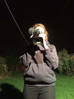
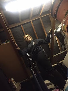
We filmed at Abigayle's house so that we could get shots of our Stalker's lair. We used the attic in the house as it was dark and was full of random objects which we thought would fit into our opening sequence well. We used some of the objects that were initially in the attic such as the little houses. This made it seem as if the character of the Stalker was properly planning an attack on the victim. We also added props such as the laptop as planned.
We also went into Abigayle's garden to film some shots as it was dark and there was a light outside which spotlighted our character but still made the background of the setting really dark and spooky. We were also lucky as there was a spiderweb which we thought would fit into the opening really well and it would link with the connotations of our genre. We used matches to make the shots even more spooky and to make the audience wonder about the intentions of the stalker.


&
LEYTON (Monika's back garden)
Filmig at monika's back garden, shed and ciggarete scenes. We decided that the dolls head would look really creepy, so we burnt their faces and hair and put them in the jar, first they appear in the shed and later on in the graveyard. The cigarette shows that the stalker is smoking , it aslso one of the thriller conventions.
Filmig at monika's back garden, shed and ciggarete scenes. We decided that the dolls head would look really creepy, so we burnt their faces and hair and put them in the jar, first they appear in the shed and later on in the graveyard. The cigarette shows that the stalker is smoking , it aslso one of the thriller conventions.
BLOGPOST 46 Filming - Greenwich and Leyton Graveyard
FILMING AT GREENWICH FOOT TUNNEL AND LEYTON GRAVEYARD + BRIDGE
Today we filmed in the Greenwich Foot Tunnel. All three of us met during the journey and made our way down to the tunnel. We set up camera's 1/3 of the way into the tunnel and started filming features of the tunnel that we thought would fit into our opening. We filmed things such as the length of the tunnel, wires on the ceiling and burnt edges. We also managed to record sounds which we will put into our opening later on in the editing.
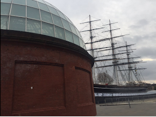
Today we filmed in the Greenwich Foot Tunnel. All three of us met during the journey and made our way down to the tunnel. We set up camera's 1/3 of the way into the tunnel and started filming features of the tunnel that we thought would fit into our opening. We filmed things such as the length of the tunnel, wires on the ceiling and burnt edges. We also managed to record sounds which we will put into our opening later on in the editing.

On the same day after college when it got dark we went to one of the graveyards in leyton where we filmed doll head scenes and some of the stalker scenes. We had to use both: camera lights and flash lights from our phones to make sure that the clips we filmed had enough lighting as it was extremely dark there.
Thursday, 26 November 2015
BLOGPOST 46 Filming - Camden
FILMING IN CAMDEN MARKET TODAY
We were filming in Camden market today, we found some weird places which seemed perfect to set the tone and genre of our film opening. We used our double lesson to do this and everything went as planned. We took some wide shots as well as close ups of graffiti and the bridge.
Wednesday, 25 November 2015
BLOGPOST 45 PROMOTING OUR FILM USING WIX
WE CREATED A WIX WEBSITE TO PROMOTE OUR FILM, OUR VIEWERS AND FOLLOWERS WILL BE ABLE TO SEE OUR JOURNEY ALL THROUGHOUT FILMING AND EDITING UNTIL FINAL PRODUCT. WE ALSO CREATED A POSTER FOR OUR FILM TO LOOK MORE PROFESSIONAL.
http://monyykal.wix.com/asmediagroup30
FOR OUR POSTER DESIGN I TOOK A PHOTOGRAPH OF MY (MONIKA'S) CRACKED PHONE SCREEN WHILE HAVING A FACEBOOK APP ON. THIS LINKS WITH OUR 'BROWSED' TITLE AND CREATES A CREEPY ATMOSPHERE. I THEN USED ADOBE ILUSTRATOR TO ADD THE TITLE AND INFORMATION.
(POSTER BY MONIKA)
FOR OUR POSTER DESIGN I TOOK A PHOTOGRAPH OF MY (MONIKA'S) CRACKED PHONE SCREEN WHILE HAVING A FACEBOOK APP ON. THIS LINKS WITH OUR 'BROWSED' TITLE AND CREATES A CREEPY ATMOSPHERE. I THEN USED ADOBE ILUSTRATOR TO ADD THE TITLE AND INFORMATION.
Monday, 23 November 2015
BLOGPOST 41 Pitch Feedback
The feedback we got after we presented our pitch.
We presented our pitch to the rest of our class and to our teacher which included our intentions and plans of our opening sequence. After completing the pitch, both our teacher and class gave us feedback; about what they liked and what they thought we could improve on.
The most common bit of constructive criticism that we received is that we needed more visuals in our presentation. We intend to fix this and add more pictures of the mise-en-scene.
Another concern was 'What if the main character cannot film all the time or drops out?'. To us this isn't a problem due to the character of the stalkers' face not being seen, so if the actor was to drop out, anyone could fill in as long as they wore an all black costume.
We will reflect on all of the comments to make improvements when it comes to filming and editing.
Saturday, 21 November 2015
BLOGPOST 40 Draft 1 of Pitch Information
1
Browsed
Our film is
about a regular teenage girl who gets followed and stalked by an unknown
figure. She finds odd things occurring everyday which starts to take over her
life; causing her to be extremely paranoid. However primarily, she doesn’t think
anything about it. The film follows the stalker, following her; getting an
insight on their plans. Death is constantly suggested throughout, but who knows
what will happen if they come face to face.
Another
film opening that influenced us was from The Conjuring. Even though the opening
consists of still images, suspense was still there due to the soundtrack and
font of the credit titles. The credit titles really fit into the images shown
on the screen, and this is what we intend to do; ensure that the font matches
the genre of our opening and that the titles fit into the opening; not looking
out of place.
The title sequence will
show a masked character, whom the audience will never know the true identity
of, stalking a regular teenage girl. This will be done online as well as in
person. We will film scenes of the stalker in their lair, planning and looking at
pictures of their victim, as well as showing the stalker watching her in her
house, out in public and on her social media sites. As the title sequence is
discrete, this will not be in any particular order and the opening will contain
clips showing pictures of the victim, dolls heads in the woods and in a grave
yard to show possible connotations of death to make the audience think and
wonder about what will happen later on in the film.
2
As
previously mentioned, our opening sequence is discrete as we believe it is best
for our chosen genre as it will keep the audience guessing.
The title
sequence of SE7EN has largely influenced our ideas for our opening sequence, especially
having closely analysed it when doing a remake of it. It keeps the audience
engrossed and entertained, making them think and wonder what will happen during
the whole film. Also, in the SE7EN title sequence, you don’t ever see the face
of the character so you do not know who is planning the events. This influenced
us a lot.
We intend
to stick to the conventions seen as we believe that this will get the best
effect and reaction from the audience.
3
The genre
of the film is a Thriller as we think they’re exciting and that we can
potentially create a really good opening due to the many initial ideas we have
had. There are many different directions to go with this genre – there aren’t too
many things that we can’t do. Our film would also fit under the sub genre
Thriller-Horror.
As
mentioned before, SE7EN was a massive influence to our title sequence. It helped
a lot that it is the same genre as the film opening that we intend to produce.
The mystery is caused not only by the actions of the unseen character, but the
music and black background credits also match the happenings as they’re placed
in a particular order so the full effect can be achieved.
Another
title sequence of the same genre that has influenced us is Unfriended. It was
more that the film as a whole influenced our title sequence than the actual opening
sequence. We loved the whole concept of the movie being an online thing, rather
than something happening on the street. We intend to include a lot of shots of
a computer, showing that the stalking also happens online but in the title sequence,
these shots will be very fast so that not many details of the victim are shown.
4
The two
main characters of the film are shown in the title sequence in different ways.
The stalker will only be seen from behind, or parts of their body will be shown
such as their hands. The victim will be shown only through pictures.
The social
group of teenagers (teenage girls) will be evident in our film opening. As she
will only be seen through photographs of her, she will be portrayed through stereotypes.
This will be done through costume and makeup.
5
Monday, 9 November 2015
PLANNING - Individual ideas
My initial idea for our group opening title sequence is a thriller/genre. I imagine the title sequence to be discrete so that it will not give much away and will make the audience want to watch the full film and to keep them intrigued throughout. One of my aims would be to make the audience once or twice during the opening.
I reckon that the idea that I imagine is quite similar to SE7EN due to analysing the sequence in depth for our remake of it. In this title sequence, I would use a lot of dark backgrounds and light to create shadows which will cause suspense and tension.I would also show one of the characters, who is the devil, at the end of the opening in a sudden way to get a reaction out of the audience.
I reckon that the idea that I imagine is quite similar to SE7EN due to analysing the sequence in depth for our remake of it. In this title sequence, I would use a lot of dark backgrounds and light to create shadows which will cause suspense and tension.I would also show one of the characters, who is the devil, at the end of the opening in a sudden way to get a reaction out of the audience.
PLANNING - Costume and Prop Ideas
COSTUMES
Costumes are one of the most important elements in the film industries. Many costume designers aim to make a product that the audience will remember and recognise. Some of the most memorable costumes to me are:
MALEFICENT
In the movie MALEFICENT actress Angelina Jolie which is the main character wears animal-skin-covered horns, wicked accessories made from animal skeleton rings and claw bracelets to feathered shoulder pieces using precious stones, crystals, leather and the odd bits of bone, teeth and even some human hair., also character wears a long black dress, cloak and a scarf. In some scenes her costume involves a massive black wings. Actress herself was involved into costume making as she envisioned the savage elegance of her character.
PIRATES OF CARIBBEAN
Jack Sparrow is a memorable character from the movie Pirates of Caribbean mostly because of his looks and funny character. He wears a dreadlock wig with lots of acessories on it: beads, feathers, coins and a dirty red headband. His beard also has been decorated with beads and eyes have been outlined with a black eyepencil to give it a stronger character. He wears a typical pirate costume; white shirt, a vest, trausers, boots and a belt with a sword. Moreover, the character wears lots of gold on him including gold rings and bracelets.
FRIDAY THE 13th (JASON CHARACTER)
Jason Voorhees character from horror movie 'Friday the 13th' can be recognised everywhere. The most memorable acssesorie is his mask, many people still use it on halloween nights. The mask covers his face and identity, there are many holes in the mask and some red scratches. It also had a leather strings to secure it on the head. Designers tried to make this mask look like it was home -made as the character lives alone in a little house in the woods. Moreover, Jason always carries either a knife or a sword with him as a tool to kill people. He wears an ordinary men outfit: trousers, t-shirt, jacket and shoes, however the clothes are dirty and covered in blood.
PROPS
I was looking at similar films and the type of props that they use and by doing so I came up with some ideas for props for our own movie:
Computer
Fake blood
Fake knife
A diary
Phone
Glasses
Rope
Chain
COSTUMES
For the costumes I was thinking that the stalker coud wear a tracksuit or either a long black coat to hide his identity.
The girl should wear dresses and shorts in the pictures of her as it shows the feminity of her and portrays the common conventions within media.
The stalker outfit (tracksuit and a snapback)
Victim in the pictures - wearing dresses.
Subscribe to:
Comments (Atom)


